Understanding Flexbox in React Native
Published on May 19, 2020 - 3 min read
Getting Started
Lets start with a simple example. A container View component with three Text components.
// App.js contents

import React from 'react';
import { View, Text } from 'react-native';
import styles from './App.style';

export default function App() {
  return (
    <View style={styles.container}>
      <View style={styles.wrapperOne}>
        <Text style={styles.textStyle}>1</Text>
      </View>
      <View style={styles.wrapperTwo}>
        <Text style={styles.textStyle}>2</Text>
      </View>
      <View style={styles.wrapperThree}>
        <Text style={styles.textStyle}>3</Text>
      </View>
    </View>
  );
}
The below shows the styles for the App.js
// App.style.js contents

import { StyleSheet } from 'react-native';

const styles = StyleSheet.create({
  container: {
    backgroundColor: '#c3ead8'
  },
  wrapperOne: {
    width: 50,
    height: 50,
    justifyContent: 'center',
    alignItems: 'center',
    backgroundColor: '#93efc4'
  },
  wrapperTwo: {
    width: 50,
    height: 50,
    justifyContent: 'center',
    alignItems: 'center',
    backgroundColor: '#73d0a5'
  },
  wrapperThree: {
    width: 50,
    height: 50,
    justifyContent: 'center',
    alignItems: 'center',
    backgroundColor: '#54b689'
  },
  textStyle: {
    textAlign:'center'
  }
});

export default styles;
Which renders as so:

Styling the Container
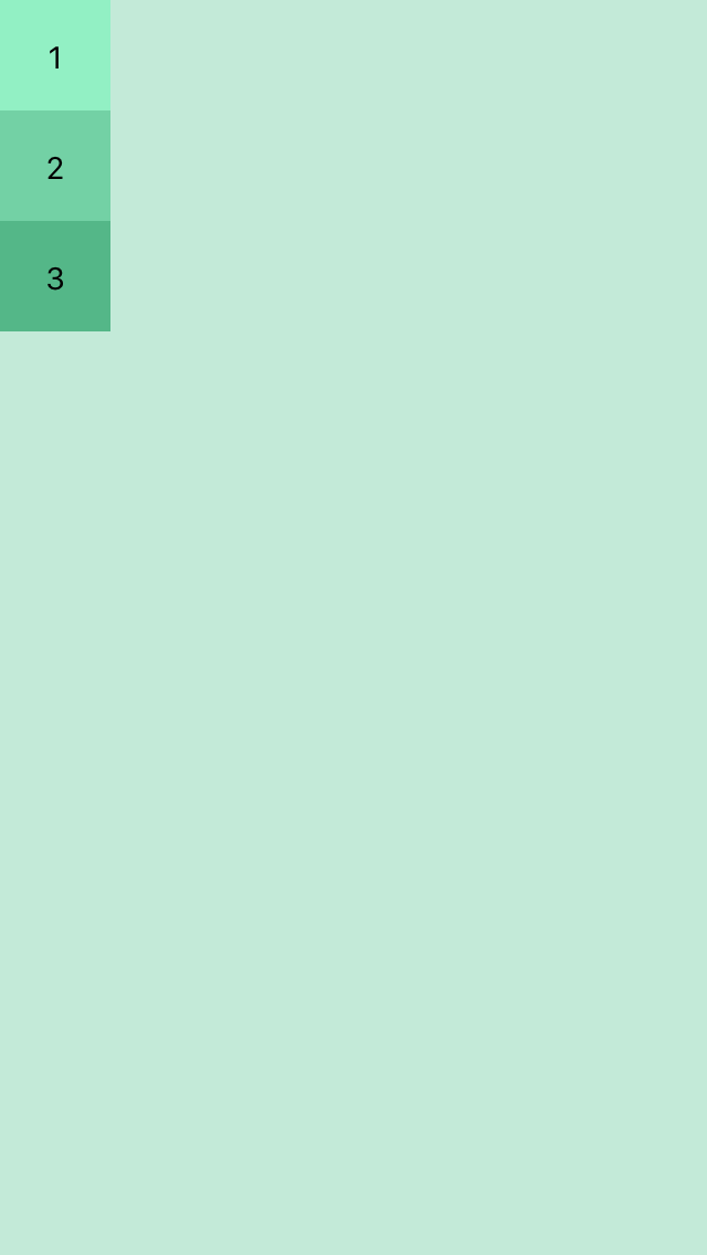
Now we add flex:1 to the container:
container: {
    flex: 1,
    backgroundColor: '#c3ead8'
}
This makes container fill its parent, i.e. whole screen.
Now we add:
container: {
    flex: 1,
    flexDirection: 'row',
    backgroundColor: '#c3ead8'
}
Each view’s flexDirection is set to colum by default but setting it to row will change the orientation of the items in the container.
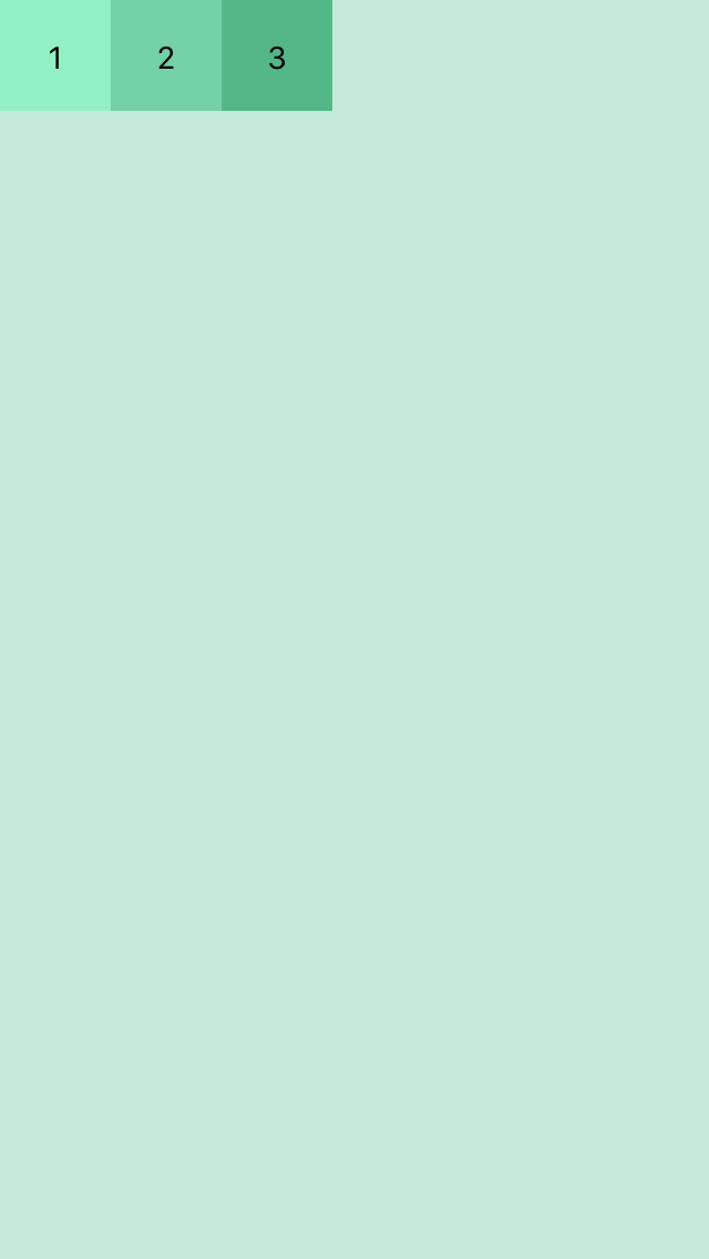
Now we can control the orientation of the content using flexDirection. Now lets add justifyContent and alignItems:
container: {
    flex: 1,
    flexDirection: 'row',
    justifyContent: 'flex-end',
    alignItems:'flex-start',
    backgroundColor: '#c3ead8'
}
Similarly for:
container: {
    flex: 1,
    flexDirection: 'row',
    justifyContent: 'flex-end',
    alignItems:'flex-end',
    backgroundColor: '#c3ead8'
}
Views will render like:
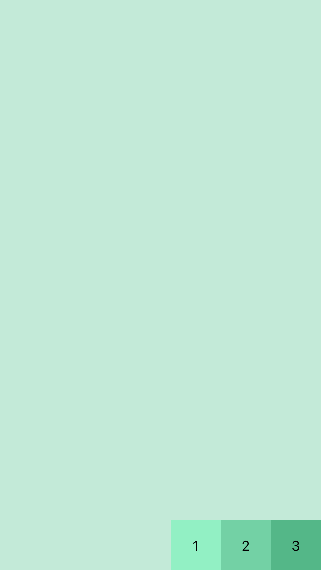
- flexDirection determines the primary axis as row or column.
- justifyContent determines distribution of children along primary axis.
- alignItems determines the alignment of children along the secondary axis.
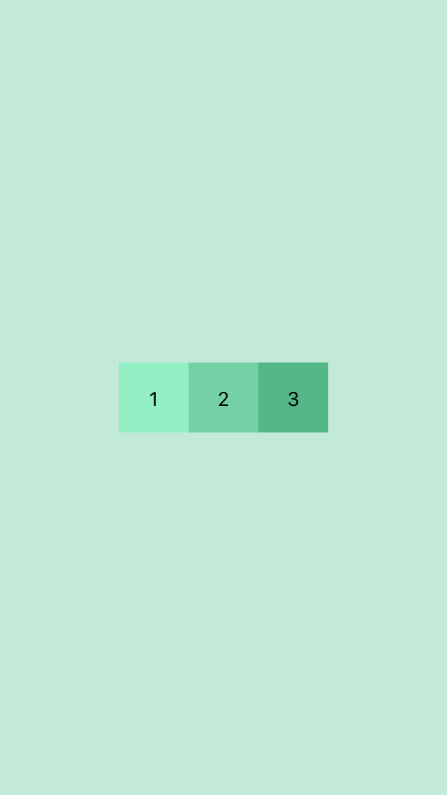
To set items to center :
container: {
    flex: 1,
    flexDirection: 'row',
    justifyContent: 'center',
    alignItems:'center',
    backgroundColor: '#c3ead8'
}
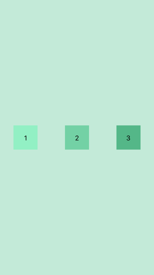
justifyContent supports flex-start, center, flex-end, space-around, and space-between.
For space-around:
and space-between:
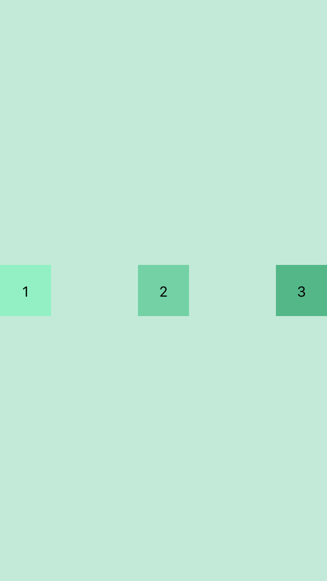
alignItems supports: flex-start, center, flex-end, and stretch.
Overriding the Container Style
If we need an item to override it’s defined as defined by the container we could use style the items individually.
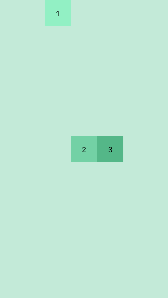
alignSelf overrides alignItems and supports these options auto, flex-start, flex-end, center, stretch and baseline.
If we tell an item to align itself to flex-start,
alignSelf: 'flex-start'It would end up like this:
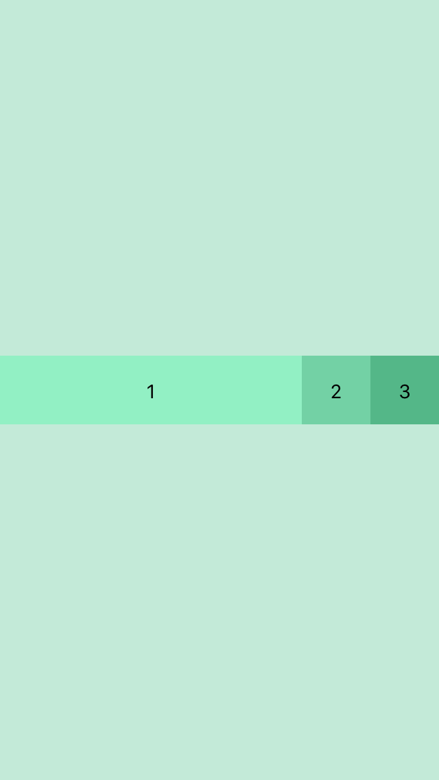
flexGrow controls how much the item will grow relative to the rest of the flexible items inside the same container.
flexGrow: 1Would render as:
flexBasis controls the item size with percent. For eg:
//wrapperOne style
flexBasis:100

//wrapperTwo style
flexBasis:50

//wrapperThree style
flexBasis:50
Thanks for Reading!
These are the basic use of flex for React View components. I will update as I learn more.
No comments?
There are intentionally no comments on my blog. If you found any errors in this article, please feel free to contact me
I convert ☕ into
I'm Ravin Pandu, I document everything I learn and help thousands of people in learning new stuffs everyday. My site has no ads, sponsors, or bullshit. If you enjoy my content, please consider supporting what I do.
A Blog About Programming And Life
Subscribe and get my latest blog post in your inbox.